In 1976, when Decathlon came into being, it was created out of friendship between sports lovers who wanted everyone to enjoy the benefits and fun of being active. But today, the brand has evolved into a global company with more than 100,000 teammates and more than 1,700 stores across 70 countries and regions, offering sporting equipment for 80 sports.
Understanding that the world is changing rapidly with innovation and technology evolving at lightspeed and creating ripple effects like stress and pressure along with sedentarism and overconsumption, Decathlon shares the belief that sport has a vital role to play in helping societies to be healthier and happier as it helps one reconnect with humanity, the planet, and one’s physical self.
Basis this, the brand has now written its North Star which is its reflective of its long-term ambition and acts as a guiding light which gave birth to a new purpose- to Move People Through the Wonders of Sport.
According to the brand, the words ‘Move’, ‘People’ and ‘Wonders of Sport’ can have multiple meaning to them, such as:
- Move: physically by helping people to live active lifestyles, emotionally by bringing joy into people’s lives and fostering connections, and behaviorally so that people adopt more sustainable behaviors.
- People: accessible to all people, at all levels- From beginners right up to expert elites.
- Wonders of Sport: The magic of doing it one’s own way, it can be the joy of participation or the thrill of performance which helps make the sport one’s own in an inclusive way.
That being said, Decathlon has not just unveiled a new ambition, a new positioning but also a new identity.
Because the brand wanted to bring joy and happy emotions to people, and empower them to practice sport on their own terms, the new brand identity, as per Decathlon, will be accompanied by a new brand platform with a new tagline- ‘READY TO PLAY?‘
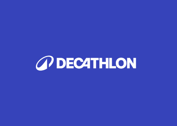
Apart from the new tagline, the brand has also unveiled a new logo which consists of two elements- Decathlon’s wordmark and its new symbol- the Orbit.
As per the brand, the Orbit is an expression of Decathlon’s North Star, building from the company’s past to project it towards our future. Its movement conveys the brand’s commitment to circularity while drawing on Decathlon’s design heritage with its iconic tilted “A”.
Representing a mountain, a sail, a wave, or even a heartbeat, the peak at the end of the Orbit closes the movement towards new heights and is a symbol of openness which allows everyone embrace it for what it means to them: whether it is accessibility, high-performance, innovation, or a positive impact on the environment.
Furthermore, the new shade of blue which is both vibrant and full of energy, represents Decathlon’s credibility as a sports brand.
But overall, the new brand identity which has been in the making for the past two years and is built on modularity, as per the brand reflects its multi-specialisation, reaching out to more people, from beginners to experts and brings joy, emotions and convey strong values of inclusivity.
Expressing her views on the new brand purpose and identity, Barbara Martin Coppola, Global CEO, Decathlon, took to LinkedIn and mentioned, “Today marks an incredibly important new chapter for Decathlon… as we share our new purpose, strategy and brand identity with the world. Guided by our purpose, to Move People Through the Wonders of Sport, we aim to build a happier, healthier world.”
With this, she also added, “Our new strategy is anchored to 3 key areas: improving customer experience, turbocharging sustainability, and modernising every aspect of our business. Core to improving our customer experience was the introduction of a fresh brand identity, which we have launched today! It is energetic, motivational and aspirational… and includes a new logo that is deep-rooted in our history – we call it ‘the Orbit’.”

