Having an interesting yet simple logo is very important for attracting customers towards your brand. Good marketers know the value of designing and packaging and the impact a good logo has in making successful advertising campaigns. The logo trends have changed a lot in past few years and now famous companies are going for minimal; approach. To give graphic and logo designers some idea about what is trending in the industry, we are sharing some logotypes that are being loved by both the expert designers and audience.
Also Read: Tips For Creating An Eye-Catching Brand Logo
1. Form simplification

Simplicity can never go out of trend, and this approach is about stripping your design into the cleanest and minimalistic version. Such logos are being used by most popular companies of the world.
2. Logos using geometrical shapes

A logo with a combination of 2 or maybe 3 simple geometrical shapes looks very neat and easy to remember. We expect that such approach will continue to remain popular in 2018 also.
3. Stacking letters

In this method, letters are placed over each other to make the long phrases easy to read. If you wanna share a message with your logo, this approach can help you a lot. Don’t forget to use contrasting colours to have the maximum effect.
4. Using negative space

Creative designers know the value of every single space in their logo and using negative space is some meaningful way can do wonders for your logo. Such logos are made by hiding images inside or between letters.
5. Gradients

The trend of gradients is back again and designers are using it beautifully. In this approach, colour transitions are applied to icons, text or both especially to massive fonts.
6. Text experimenting
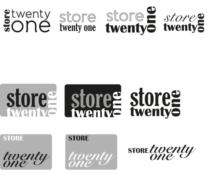
2017 saw so many famous logos that were only designed by experimenting with text in new ways. This can be done with using multiple fonts, irregular spacings, and other such tools. Imagination plays a vital role in making such logos.
7. Overlaps
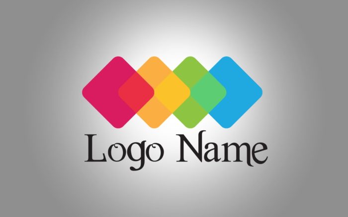
Another traditional logo making approach that is coming back to the trend is overlapping with different shapes and icons. Overlap logos are easy to remember and remain in our mind for a long time.
8. Slices
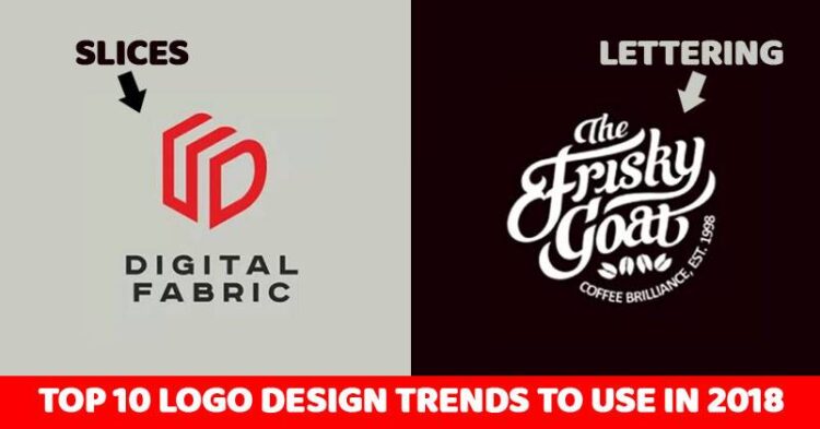
Slices are great ways to create an attention-grabbing logo, these are made in a way that wide parallel lines are designed to look like cuts in the logo.
9. Coats of arms
As the name suggests, such logos can make the viewers focus on the center part of the logo in which you can put your main idea. Such logos are very clear and showcase the tradition, heritage, and longevity.
10. Lettering

Although, this approach is complex as compared to other designs but is trending and catching attention of the audience which is the most important part. These logos are mainly used by coffee shops, photographers, hair stylist, and artists.
These logo trends have been taken from here and our only aim is to share this meaningful information with our audience.


