


Imagine if the Amul girl, the cheeky cartoon who has been trolling politicians and cricket stars since the 1960s, was scrubbed out and replaced with a plain sans-serif font saying just ‘Amul.’ Or if the Parle-G child, the wide-eyed face of Indian teatime, was swapped for a faceless geometric blob. Stretch that horror further: the twirling Nirma girl erased from detergent packs, the mischievous Onida devil retired forever, or the plump Vodafone Zoozoos flattened into some minimal icon. Outrage, right?
That’s basically what happened in August 2025 when Cracker Barrel, a U.S. restaurant chain known for its grandma’s house aesthetic, ditched its moustachioed mascot Uncle Herschel and his wooden barrel for a flat yellow blob that looked more like a vitamin tablet than a brand logo. Customers revolted, memes exploded, and within hours the company sheepishly rolled back the change. Ironically, its stock even jumped after the reversal. The lesson? Messing with memory can cost you more than a rebrand ever saves.
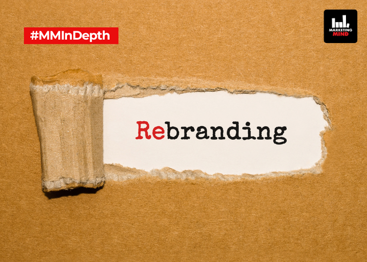
This fiasco is a masterclass in what happens when minimalism goes too far. Over the past decade, logos everywhere have been put on a design diet. Gone are the shadows, curves, and flourishes. In their place: neat sans-serif fonts, flat colours, and stripped-down icons.
Google set the tone in 2015 with its geometric wordmark, pixel-perfect across screens. PayPal followed with a simplified logo designed to flex from smartwatches to smart TVs. These weren’t vanity updates, they were digital survival tactics. In a world where brands spend more time as tiny app icons than giant billboards, simplicity isn’t just stylish, it’s functional.
But clean doesn’t always mean connected. Burger King’s 2021 rebrand nailed the balance. Its chunky retro ‘burger in a bun’ mark harked back to 1969 while looking crisp on apps. Pepsi pulled a similar trick in 2023 by reviving its 1960s badge with a bold, digital-ready twist. Even Baskin-Robbins leaned into nostalgia during its 2022 refresh, making its hidden ‘31’ more prominent. These rebrands worked because they didn’t erase history, they remixed it.
Others stumbled. Burberry’s 2018 shift to a stark wordmark ditched its iconic knight-on-horse crest, only to resurrect it in 2023 after fans called the brand soulless. Jaguar’s 2024 rebrand was even more jarring: the leaping cat vanished, replaced with a glowing neon ‘J’ and psychedelic ads that left loyalists asking, ‘But what even is Jaguar now?’ Like Cracker Barrel, Jaguar discovered loyalty isn’t built on novelty alone.
In India, the rebranding wave has been just as powerful, but often more nuanced. Air India’s 2023 revamp replaced its dated look with ‘The Vista,’ a sleek golden window-frame symbol, while keeping the Maharaja alive in lounges and ads. Zee collapsed into a bold ‘Z’ monogram but balanced the minimalism with a rich cultural colour palette. Meesho brightened its logo with Jamuni purple and Aam yellow, playful, very desi choices, while layering in multilingual sonic branding to feel at home across India’s many tongues. Even Colgate and Boldfit refreshed with ‘digital-first’ identities but didn’t ditch their heritage cues. These examples show minimalism works best when you leave just enough spice in the curry.
Because mascots in India aren’t just mascots, they’re cultural furniture. The Amul girl isn’t a doodle, she’s political satire wrapped in butter. The Parle-G kid is shorthand for every tea-dipped biscuit from our childhood. The Nirma girl, the Onida devil, the Vodafone Zoozoos, they’re not just branding, they’re memory. Remove them, and you don’t just lose a logo, you lose a piece of identity.
And nostalgia isn’t just for boomers. Gen Z, the generation supposedly obsessed with what’s next, is leaning back into retro aesthetics too. Y2K fonts, VHS filters, vintage brand packaging, they eat it all up. A viral AI video in 2025 reimagined the Amul girl, Parle-G child, and Nirma girl in 3D, and it left both older and younger audiences teary-eyed. Nostalgia, it turns out, is timeless currency.
That’s why Tropicana’s infamous 2009 rebrand flopped so hard: in two months, it lost 20% of sales, nearly $30 million, before quietly reverting to its old design. Strip away too much memory, and customers simply don’t recognise you.
Interestingly, some bold rebrands without nostalgic crutches have also worked. Swiggy’s pin-drop orange identity wasn’t just a cosmetic change, it was a complete overhaul, carried through its app, packaging, and even its cheeky, relatable brand voice. Zomato pulled off a similar reset when it unified under a stark red wordmark, simplifying its identity while betting on bold consistency. Over time, the clean red logo became so synonymous with food delivery that it needed no mascot, no nostalgia, just scale and clarity. These overhauls worked because they offered a strong new story. But they remain exceptions rather than the rule. For every Zomato or Swiggy that nails it, there’s a Jaguar or Tropicana reminding us how risky it is to toss heritage aside.
So when does minimalism work, and when does it backfire? The golden rule: don’t ditch your heirlooms. Burger King kept its buns, Pepsi kept its swirl, Air India kept its Maharaja. Cracker Barrel tossed Uncle Herschel, and the bin spat him right back out. Minimalism should simplify, not sterilise. Done right, it makes a brand timeless. Done wrong, it makes it soulless.
And here’s the kicker: sometimes brands rebrand without changing much at all. A new font, a slightly tweaked shade, maybe a flatter icon. But if no one notices, was the change even worth the millions spent?
Looking forward, the question only gets trickier. With AI-generated design on the rise and branding automation becoming mainstream, will companies double down on heritage icons to stand out, or will they chase minimalism by default? The future of branding may well depend on which side of that tug of war wins, but one thing’s certain: erase the Amul girl at your peril.


