


MullenLowe Lintas Group’s specialist design consultancy, dCell, has partnered with Piramal Littles to unveil a refreshed identity for the brand’s childcare range. The new identity preserves the brand’s trusted legacy while adopting a warm, modern, and emotionally engaging visual language.
Piramal acquired Littles in 2015. The brand offers a wide range of childcare products including diapers, bath and skin care items, feeding essentials, and toys. The aim of the redesign was to create a master packaging system that retains the brand’s deep-rooted familiarity and consumer trust while offering a unified look across product categories.
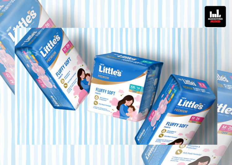
The updated identity balances the brand’s legacy with its future direction. It has been designed to be modern yet sensitive, and playful yet reassuring, reflecting the spirit of care that defines the Littles range. Elements such as typography and illustration have been crafted to ensure the packaging stands out in the marketplace while connecting with caregivers on an emotional level.
The design system brings consistency across all products while allowing each category and tier to maintain its own distinct identity. The pack’s structure and graphics were inspired by the bond between mother and child, using shapes and illustrations that symbolize care and connection. Custom iconography and handwritten typography have been introduced to enhance brand personality and approachability.
The redesign addresses the challenge of bringing together products with different formats and propositions, ensuring that they appear unified under a single brand identity while remaining intuitive and user-friendly for consumers.
Commenting on the new packaging, Shashank H. Golani, Senior General Manager – Marketing at Piramal Littles, said, “dCell expertly balanced the challenge of unifying our diverse range – from diapers to toys to baby care – under one brand look, while ensuring each category and tier retained its own identity. Their keen understanding of category nuances and consumer shopping behaviour made our packaging both intuitive and distinctive.”
Bhumika Shah, Executive Design Director at dCell, added, “Our core design was born out of the idea of an embrace. The pack’s architecture that formed the design system across all products was a nod to the mother and child bond represented by curves juxtaposed on each other to form a graphic that came together from the two ends of the pack. We elevated the brand’s imagery by establishing a unique illustration style for their premium products and handwritten type that fosters a human connection. The iconography was custom designed for the brand and lent a sense of expertise and elegance to the range. The greatest challenge was harmonizing the diverse range of products carrying different propositions and having different packaging formats and structures to look unified under a single brand umbrella.”


