


2025 was the year brands stopped whispering and started showing up in your day-to-day life with new faces. From chips that now literally look like they came from a farm to streaming platforms doing an embarrassing name-backflip, this was a season of visual shake-ups. Logos got brighter, names got shorter, and packaging got bolder, proving that when brands change, everyone notices.
Here’s the full scoop on the top 10 rebranding moves of 2025, all real, all visible, and all major enough that you probably saw them without even knowing it.
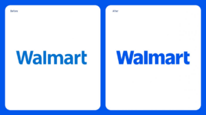
1. Walmart’s Custom Logo Redesign
Walmart kicked off the year with a refreshed logo featuring a custom font inspired by founder Sam Walton’s trucker hat and vibrant blue and yellow colors. The iconic spark remained, but with a cleaner, more digital-friendly look rolled out globally early in 2025.
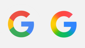
2. Google’s ‘G’ Gets a Smooth Gradient Makeover
After nearly a decade, Google updated its single-letter ‘G’ app icon to introduce a seamless gradient blend of its signature colors, making the logo feel more modern while keeping it instantly recognizable.
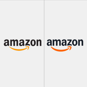
3. Amazon Refines the Smiling Arrow Logo
Amazon quietly refreshed its famous smile logo and visual system in 2025, polishing the arrow and typography for better digital presence across apps, packaging and signage, including in India.
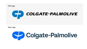
4. Colgate-Palmolive’s Purpose-Forward Identity
In August 2025, Colgate-Palmolive introduced a new corporate logo and identity system, paired with a meaningful tagline that reflects purpose and optimism, a modern look for a heritage brand used globally.
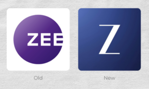
5. ZEE Entertainment Rebrands to ‘Z’
On 7 June 2025, Zee Entertainment Enterprises unveiled a major rebrand across its TV channels and properties, replacing its long-standing circular “Zee” logo with a simplified stylised “Z”, along with a new slogan, “Yours Truly, Z”. The rollout was timed with its 25th anniversary celebrations.
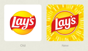
6. Lay’s Unveils Its Biggest Redesign Yet
Lay’s, the world’s top potato chip brand, rolled out its largest redesign in almost a century. The refreshed packaging and logo emphasize natural ingredients (including highlighting real potatoes on packs) and feature a warmer sun motif known as “Lay’s Rays”, tying visual identity to product origin.
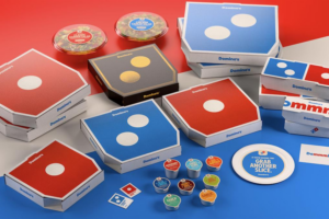
7. Domino’s Pizza
After 13 years, Domino’s introduced a bold new brand refresh in 2025 featuring brighter red and blue colors, an updated custom font (“Domino’s Sans”), revamped packaging, and even a new branded audio jingle (“Dommmino’s”) performed by artist Shaboozey. The visual identity began rolling out across stores and digital platforms throughout 2025.
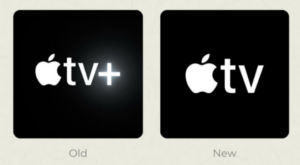
8. Apple TV Drops the ‘+’
In a minimalist move consistent with Apple’s design ethos, Apple removed the “+” from its Apple TV+ service name in 2025. The unannounced update simplified the brand across apps, marketing and platform interfaces.
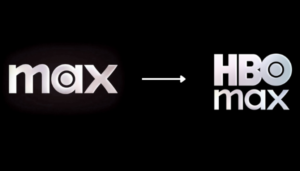
9. HBO Max Brings Back Its Original Name
After previously shortening its name to “Max,” the streaming service officially reinstated the name “HBO Max” on July 9, 2025, acknowledging the strength of the original brand and its global recognition.
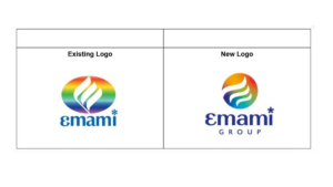
10. Emami’s 50th Anniversary Logo Refresh
Indian conglomerate Emami celebrated its 50th anniversary with a brand refresh and new logo in 2025 that balanced heritage with modern visual storytelling, a rare and noteworthy India-centric rebrand.
2025 wasn’t just another year on the calendar, it was the year brands gave themselves a mid-life glow-up. Some did it with subtle elegance, others with farm-fresh cheekiness or pizza-powered personality. When a logo tweak makes you do a double-take, you know the world of branding just got a bit more dramatic, and a lot more fun.


