


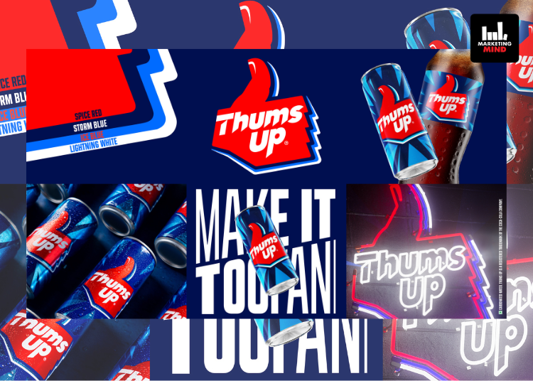
Thums Up, India’s homegrown cola brand, has one of the most recognizable logos. Today, the brand unveiled a new identity that reflects a new India defined by ambition, confidence, and a drive to maximize every moment.
Thums Up’s in-house design team developed the rebrand in partnership with the design agency SUPERULTRARARE®. The new identity marks Thums Up’s first major visual evolution in over two decades . The refreshed look retains strong legacy elements while introducing a more dynamic and contemporary visual world. Its trademark logo has been updated only three times since inception, with each evolution reflecting changing youth culture and the spirit of young India.
The new brand world balances the strength of Thums Up’s distinctive assets with a progressive and contemporary vibe. Typography is sharper, and the tri-color palette of spiced red, iced blue, and storm blue reflects heritage, taste, refreshment, and adventurous personality. Dynamic detailing preserves the thumb-mark, reinforcing the brand’s enduring spirit. The logo has also been optimized for consistency across screens and retail shelves.
Launched in 1977, Thums Up has reshaped the cola category with its bold spicy taste and sharp positioning among adventurous youth. The brand’s Toofani spirit has been highlighted through campaigns such as #TasteTheThunder, #AajKuchToofaniKarteHain, #PalatDe, and #SoftNahinToofan. Last year, Thums Up introduced Thums Up XForce, a no-sugar variant, which became the largest no-sugar drink in six months of launch.
The refreshed visual identity prepares the brand for the next chapter, maintaining its unapologetically Toofani spirit while aligning with contemporary youth culture.
Sumeli Chatterjee, Senior Director, Sparkling Flavours, Coca-Cola India and Southwest Asia, said: “For nearly five decades, Thums Up has been a defining force in youth culture representing bold and relentless confidence with an unmistakably ‘toofani’ spirit. Its iconic ‘Taste The Thunder’ line, strong taste, and adventurous communication have inspired generations, making it the drink of choice of young India. The new Thums Up visual identity is a strategic step forward that reinforces our cultural relevance as we unlock the next phase of growth and make the brand world more dynamic, distinctive and exciting for the future.”
Matthew Kenyon, Founder, The SUPERULTRARARE®, said: “We set out to distill the core essence of what Thums Up represents and what emerged was a powerful cultural signal – strong, resilient, and iconic…just ready for the present. Building on this, we sharpened the identity by preserving what consumers love while amplifying what lies ahead – resulting in a bolder, clearer expression designed for today’s Indian youth.”


