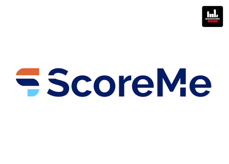
ScoreMe has unveiled a refreshed brand identity, introducing a new logo and updated colour palette as part of its effort to strengthen market presence and improve brand recall. The Indian fintech company, which provides AI-driven credit analytics and digital lending solutions for banks and NBFCs, has aimed to enhance visibility and familiarity among customers through the rebrand.
The company has aligned the updated identity with its focus on innovation, reliability and user-centricity. The refreshed design has incorporated three key elements, aesthetics, user centricity and brand values, into a visual system intended to present a modern yet consistent brand image.
At the centre of the rebrand has been a new logo built around the letter “S”. The design has reflected forward-looking thinking through its structure, while the blue typography has represented stability and trust. Accents of orange have added contrast and visual energy to the identity. ScoreMe has also adopted the Raleway typeface to present a contemporary yet professional appearance.
The refreshed colour palette has included orange to represent positivity and security, navy blue to convey stability and expertise, and light blue to signal clarity and professionalism. The brand name has continued to appear in deep navy blue to reinforce dependability and credibility.
“This rebranding initiative is more than a visual update; it is a reaffirmation of ScoreMe’s mission to deliver innovative solutions with clarity and confidence. By combining aesthetics with meaning, the new identity ensures that ScoreMe stands out in a crowded marketplace while staying true to its values,” said Shashank Sharma, Co-founder and Director, ScoreMe Solutions.
“As ScoreMe continues to grow, this brand refresh marks a significant milestone in its journey toward becoming a more recognizable and impactful player in the industry. The new logo, colours, and typography collectively embody the company’s vision of stability, innovation, and trust.” Sharma added.


