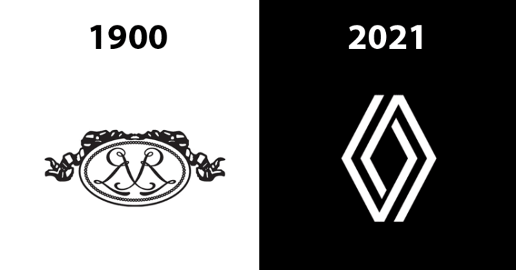
With a number of new changes taking place in the world of brands, Renault swings by with its new identity. Featuring a new company logo, the company has retained its diamond shape and will be utilizing the same for all cars around the world by 2024.
How did Renault Get Its Diamond Design?
It was in 1925 when Renault received its diamond identity which has stuck with all of its loyal customers. The new logo was studied between 2015-2019 before being ultimately executed. It was done under the watch of Renault’s design director, Gilles Vidal.
The logo is representative of the modern era whilst retaining its original identity. Over the years, the shape of the logo has definitely changed with the diamond becoming a trademark since the 1900s.
Have you seen all the Renault logos yet?
How did Renault’s logo look from the beginning of time?
Since the company’s inception, this is how the company logo received its much-appreciated transformation.
1900

1923
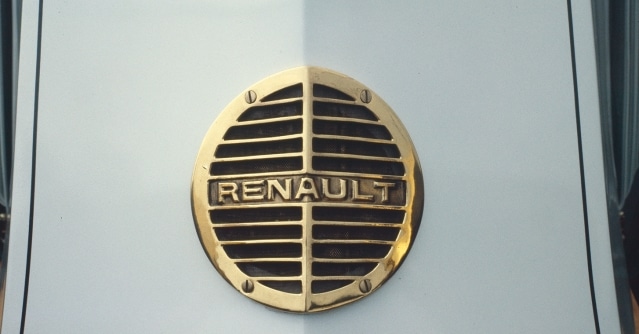
1925
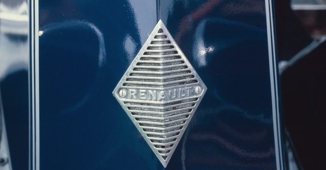
When the diamond was incorporated at Renault.
1959
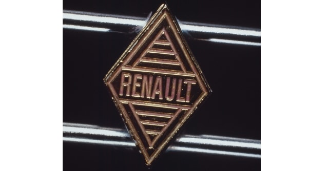
1972
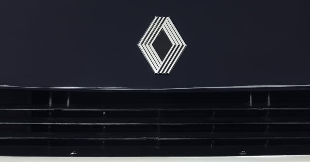
2015

2021

The new logo was revealed this week. This brings a total of 9 do-overs in more than 100 years!
This new identity is also devoid of any typography. Customers are now shifting towards a recall value that can be seen by other brand logos as well like Apple, Nike, Puma, and even Amazon. Keeping in sync with the attention span of today’s generation, a logo as good as this definitely grabs eyeballs while maintaining a sense of minimalism.
Do you prefer the new logo over the previous ones?


