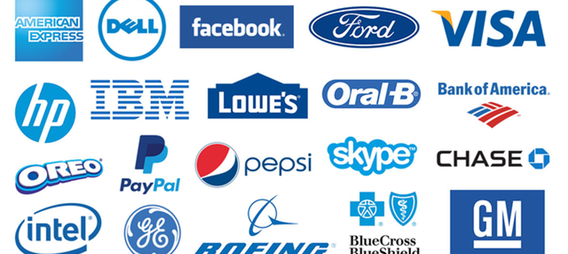
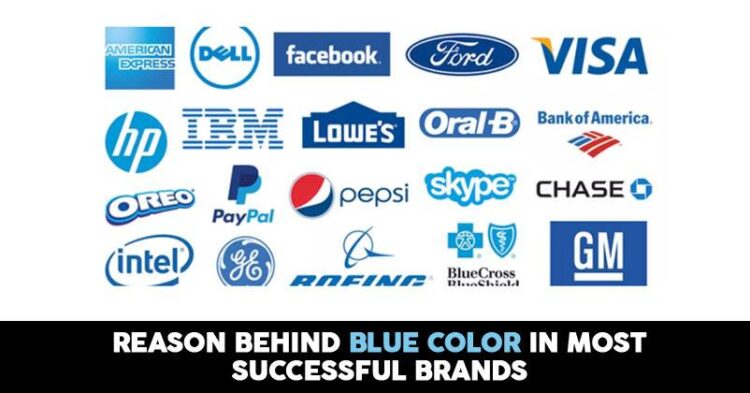
What similarities do you find when you see the logo of brands like Facebook, Twitter, Linkedin, IBM, Hp, Intel, Samsung, BMW, Walmart, Pepsi, SAP, Nivea etc?. They all have blue color in their logo. Have you ever wonder why so many popular brands in the world have a blue logo? why blue is the most preferred color among the crowd? Let us have a look for the answer to these questions in this article.

Why everyone likes blue?
What comes to your mind when you hear the word blue? Sea, water, sky. Blue is closely associated with harmony and peace. It is a color that evokes trust, honesty, loyalty, and confidence. It reduces stress and creates a sense of relaxation, tranquility, and calm. It is the color of trust and responsibility. According to Color Wheel Pro, “light blue is associated with health, healing, tranquility, understanding, and softness. Dark blue represents knowledge, power, integrity, and seriousness.” In addition, blue symbolizes faith, truth, and wisdom.
As early as the 1940s, when scientists started asking people about their color preferences, tons of people picked blue. It was a global phenomenon among young and old, the rebellious and the conservative, Eastern and Western.

Slowly, scientists started to work out why. It turns out like if you look at all of the things that are associated with blue, they’re mostly positive. It’s really hard to think of negative blue things. On the other hand, wonderful blue things — clear skies and crystalline seas, for example — leap rapidly to mind and exist as a constant across cultures (everyone loves clean water and nice weather). The ocean and sky are also mighty, like blue. Indeed, blue conveys feelings of strength, dependability, and tranquillity.

Why most brands prefer blue?
Technology brands like Dell, IBM, Intel, and AT&T take advantage of blue’s trustworthy message; they create products that people rely on day after day. It’s a handy go-to color for any company that prides itself on its professionalism, reliability, and hardiness. One of our findings was top businesses like to focus on just one or two colors to represent their brand, and reigning chief among these colors was the trusty and popular blue.
Top businesses like to focus on just one or two colors to represent their brand, and blue is trusty and popular among these. Blue does not only represent 28% of top-earning businesses, but it’s also most people’s favorite color. It represents trust, cooperation, purity, and tradition.
Also Read: How Different Colors Tell A Lot About Marketing Of The Brand
Its conservative reputation and typically cool tone make it very popular for science and technology companies, while its association with water and sky make it great for environmentally conscious endeavors and wellness brands. Of the top 100 companies, most of those choosing blue are in technology and business or banking sectors, speaking to blue’s reputation for reliability.
So now this is no surprise that why most the brands use blue in their logo.


