


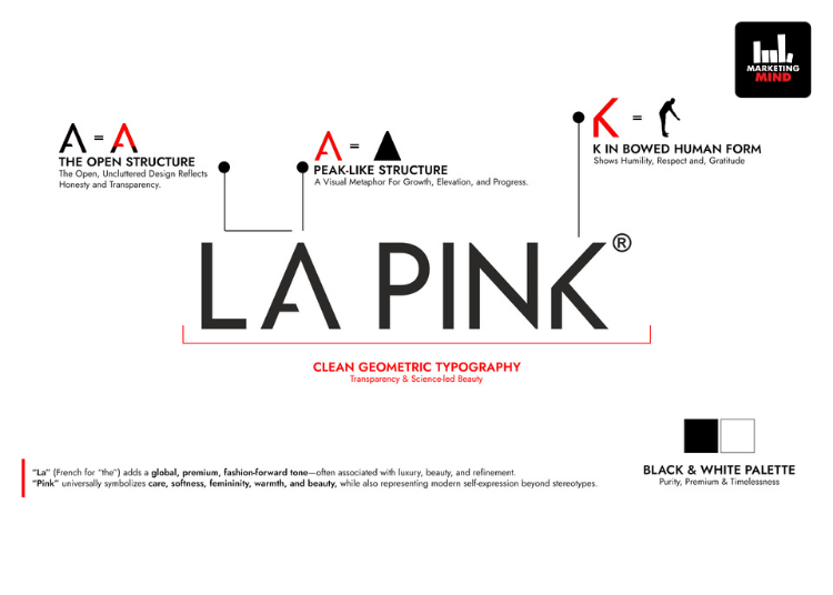
La Pink has rolled out a brand refresh that has included a new logo, a redesigned corporate website and updated packaging for its fragrance category. The beauty brand has introduced a new visual identity that has replaced its earlier pink-and-green emblem with a black wordmark, signalling a shift towards a cleaner and more minimal design language.
The refreshed identity has reflected the company’s focus on formulation-led positioning and product transparency, while retaining its microplastic-free proposition. As part of the update, La Pink has also refreshed the packaging of its fragrance range to align with the new brand look and ensure visual consistency across products.
The company has additionally launched an updated website that has offered improved navigation, enhanced product information and a more streamlined browsing experience. The digital overhaul has supported the brand’s broader effort to strengthen its consumer interface and consolidate its positioning in the beauty category.
“La Pink was created with a single-minded purpose, to offer beauty solutions that are genuinely safe for consumers. As we continue to grow, it became important that our identity reflects the sophistication and progressiveness of our formulations. Our new logo is sharper, modern, and globally aligned. The refreshed packaging and website will further elevate customer experience, making it easier for people to explore our world of 100% microplastic-free formulation products. This updated identity marks an important step in our journey ahead.”- Nitin Jain, Founder, La Pink


