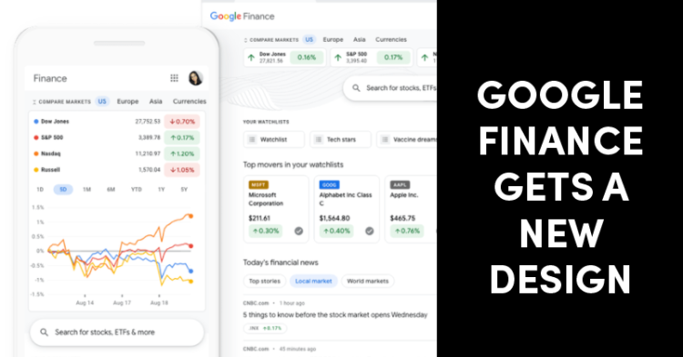
Google has launched a new redesign for Google Finance for desktop and mobile versions which are mainly focused on ease and efficiency for users.
Google Finance launched over ten years ago to help investors manage and check their stocks. Over the years, its interface has remained the same. However, the new update will make it easier for users to find data for stocks, market trends, and relevant news you’re interested in. This in turn will help users make more informed investment decisions as per Google.

There have been 2 major changes or inclusions in the interface. The first is the use of bold colors which makes different shares stand out and easier to read. In a statement, Google has said that “understanding context is key to making informed investment decisions.” With the aim of making it easy for users to find and compare information by keeping the organization helpful.
The other change has been made to Google Finance‘s watchlist feature. The redesigned feature will allow users to stay up to date on news, stats, and earnings details that they actually care about. This will also provide context on stock movements and allow users to track trends of stock over time.
Amongst other changes, Google Finance will also focus on increasing financial literacy. Google has said that “you’ll find explanations and descriptions of key terms and stats to help you learn as you go.”
Also at the top of the page, you can now compare major markets worldwide. Google Calendar integration has also been changed which allows users to see company events and earnings calls. These may appear in the right-hand panel.
The new version of Google Finance is all set to launch in the US in the coming weeks.


