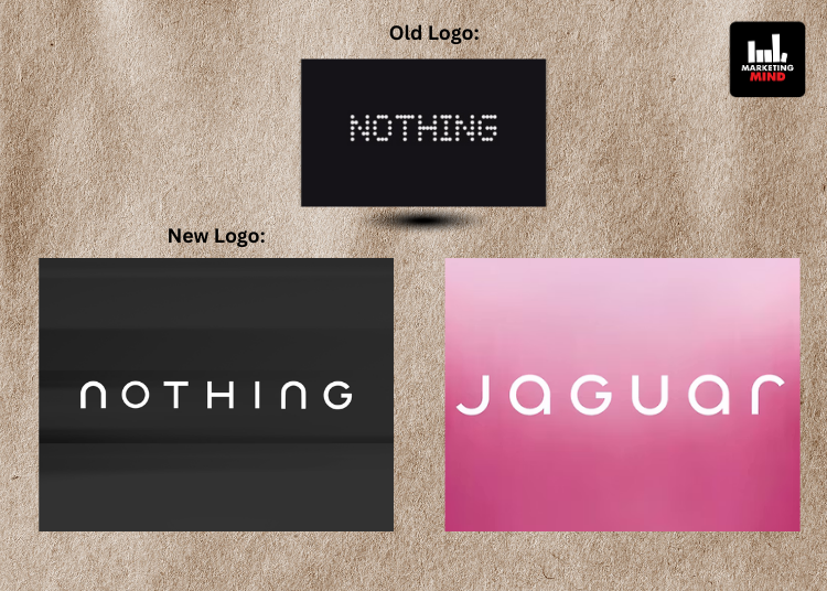
Nothing has teased a new logo on X and, in doing so, has set off an unexpectedly lively typography debate online. The smartphone maker has signalled a move away from the dot-matrix, pixel-style identity it has been known for since launch, replacing it with a cleaner, more conventional wordmark that instantly caught the internet’s attention.
The teaser post, accompanied by the line “Getting ready to make history,” has featured two monochrome images of the new logo. Visually, the shift is hard to miss. The familiar pixel-inspired lettering has given way to a smoother, more polished typographic style, marking a clear break from Nothing’s original design language. Beyond the images, however, the company has offered no explanation, leaving plenty of room for speculation.
Notably, Nothing has not attached the teaser to any product launch, event date, or hardware announcement. The absence of such details has suggested that this reveal has been less about smartphones and more about a broader rethink of how the brand wants to look and feel going forward.
Naturally, X has had opinions. Scroll through the comments and a recurring theme pops up: Jaguar. Several users have been quick to draw parallels between Nothing’s new wordmark and the luxury carmaker’s recent rebranding, pointing out similarities in the font style and overall aesthetic. Some have asked if the resemblance is intentional, while others have treated it as an amusing coincidence in the age of minimalist logos.
For now, Nothing has stayed quiet on the comparisons. Until the company shares more context, the question remains open, is this a carefully considered design evolution, or just another case of modern branding trends making very different brands look strangely familiar?


