When it comes to product placement & branding, the brand logo of a company plays a very vital role. A logo becomes something that the consumers can directly relate to the product or service offered by the brand.
Over the years, all big brands in the market had made sure that their logo is something that stands apart. From its font to its color everything has a meaning behind it.
Today we bring you certain brands that have a and all-green logo design and have stood apart from their competitors.
1. Acer
Acer Inc. is a world-famous Taiwanese electronics company founded in 1976 by Stan Shih with his wife and their partners. First opened in Xizhi, New Taipei City, the company started producing laptops, personal computers, smartphones, and other electronic devices.
The use of green color in the Acer logo symbolizes growth, freshness, uniqueness and environmental production of the company.
2. Carlsberg
The first Carlsberg logo featured an elephant and a swastika. For political reasons, the logo was abolished in the 1930s. The company’s current logo goes back to 1904. It was hand-drawn by Thorvald Bindesbol, an industrial designer from Denmark. The logo features the Company name, and the font pretty much retains the designer’s handwriting. It is topped by a crown, which symbolizes the company’s ties with the Royal Danish Court.
3. Android
The original Bugdroid Android logo was designed by Irina Blok. The idea was to create the open-source logo (very much like open-source Android platform), that was released to the developer community without regular brand guidelines. Blok’s portfolio also suggested that “Initially the logo was meant for the developer community, but it quickly became consumer-facing.”
4. Doublemint
For the back story for the brand’s logo and name, the Wrigley Company, a chewing gum manufacturer, introduced its “double strength” peppermint gum, with twice the flavor, in 1914. The advertising department quickly capitalized on the word “double” by including twins as their spokespeople.
5. Heineken
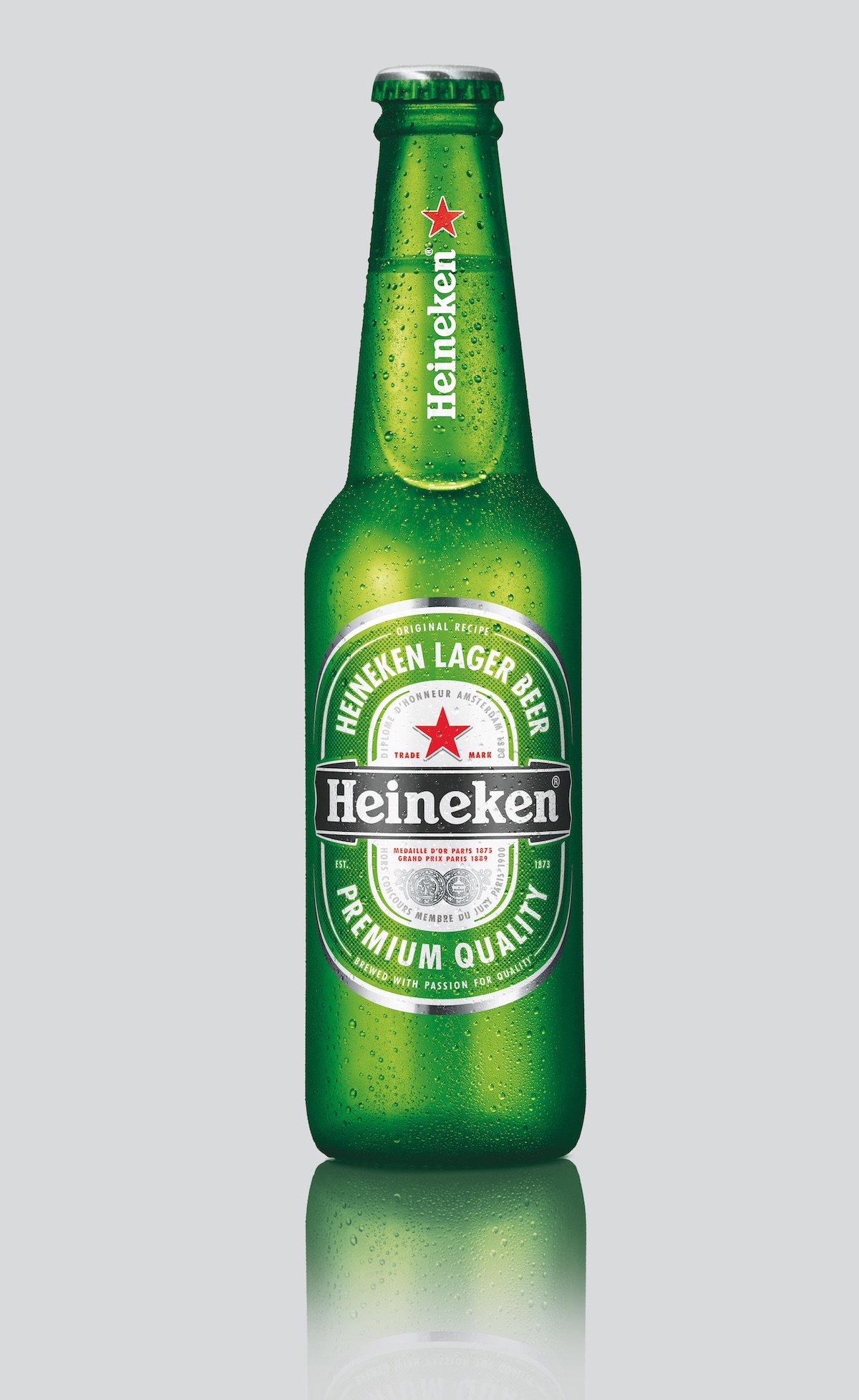
The current version of the Heineken symbol uses three colors. Green is reminiscent of the color of the bottle. It is a pretty recognizable shade, which is sometimes even referred to as the Heineken green. To create a visually appealing contrast, designers added red and black.
6. Starbucks
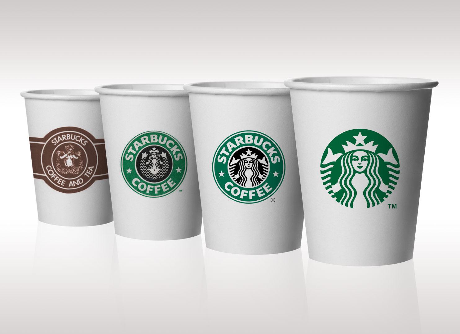
The latest Starbucks logo is a much-simplified version of its old logos as the surrounding text and the double outer circles have been completely removed. The green color palette was introduced so as to represent the growth, freshness, uniqueness, and prosperity of Starbucks.
7. Sony Ericsson

The logo makes the use of two vibrant colors, Green and Silver which signify growth, sophistication, creativity, and perfection. Also, If you look carefully, the Sony Ericsson logo signifies the combination of letter ‘S’ and ‘E’ ie. the merger of two giants, ‘Sony‘ and ‘Ericsson‘
8. Lacoste

Lacoste is a French company, founded in 1933 by tennis player René Lacoste and André Gillier. The company can be recognized by its green crocodile logo. René Lacoste, the company’s founder, was nicknamed “the Crocodile” by fans because of his tenacity on the tennis court.
9. Land Rover

Rumor has it that the oval shape of the logo was inspired by a tin of fish, which the designer Maurice Wilks was eating for lunch at the time. Color: The green may symbolize nature and a Land Rover model’s ability to get you out of the city and off the paved roads.
10. Tropicana


