Uber is now a well-established name in India and some markets it has left the competition like Ola behind. Moving on to become an IPO from a startup, UBER has given itself some major rebranding exercise.
The New Logo
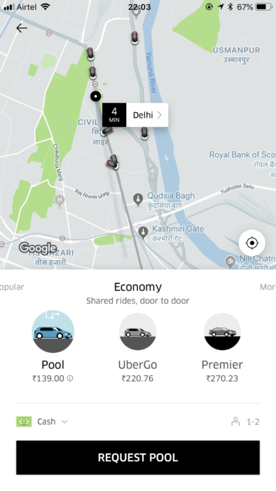
Uber now has a new logo and design interface. The old logo has been replaced with a simple text that says UBER in white over a black background. The text is written in a customized font designed especially for UBER. Fonts used in iconic transportation systems around the world inspired the custom-made font, called Uber Move and there is a hidden imagery thrown in between. The line between U and B looks like a road as the app zooms when it opens.

Underlined Reason for Change
In its own words, UBER says “Today you’ll start seeing our new logo, it is easy to see, easy to recognize and easy to spot around the world”
This communication of easy recall is the main reason behind the logo change. As per Peter Markatos, Uber’s Executive Director, “As we expand our reach into our other markets and modalities, it’s super important that it’s very clear that when you’re getting into an Uber car or on an Uber scooter, you know that is an Uber product.” “We weren’t achieving that with our current system. It doesn’t make sense to build more equity into something that people don’t understand.”
The earlier logo was a symbol chosen two years ago by the then CEO Travis Kalanick, which now didn’t seem to be working out.

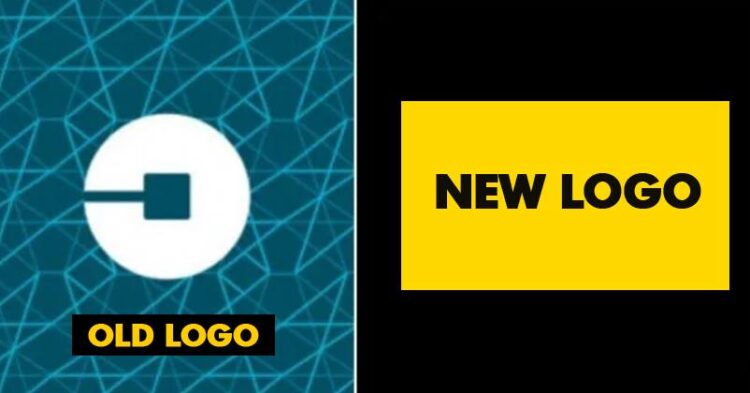
The Old Logo
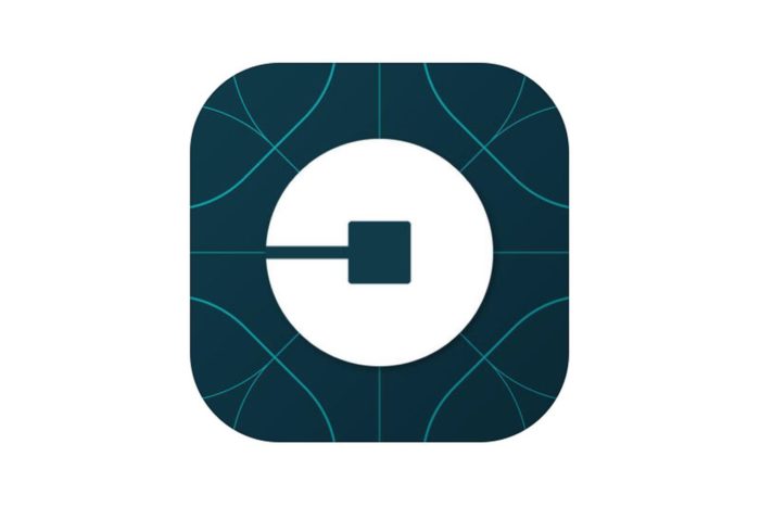
The previous logo, which had been unveiled in February 2016, was supposed to convey a deeper meaning about Uber’s mission. The square supposedly represented a “bit,” while the circle depicted an “atom” — two things that the company prided itself in bringing together. The “bit” was the technology that Uber used, while the atoms were the physical space it operated in. “The unique aspect of Uber is that we exist in the physical world,” Travis Kalanick had then said. “We exist in the place where bits and atoms come together. That is Uber,” he’d added.
This hi flying fundamental didn’t go down too well with the public as per the current management, and hence the need for change.
Way Ahead
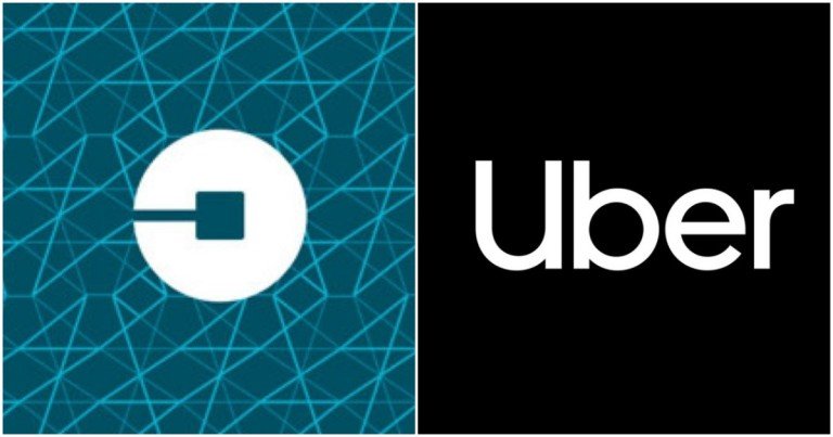
The current branding looks more corporate and sophisticated. Though during Travis’s tenure, all he spoke of was bits and atoms and the importance of the symbolization that logo represented. His last days in the company saw him more engulfed in controversies of sexual harassment and law evading agencies. Dara Khosrowshahi had stepped in as CEO in August last year and has since looked to take Uber on a new path, one that he’s said will likely end up with an IPO. This brand new logo and interface is just the beginning of the positive change Dara aims at bringing into the company.


