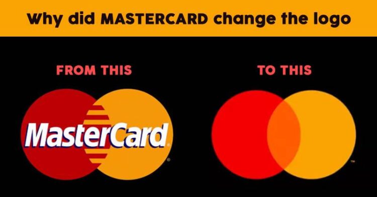
Logos create brand identities and it is a known fact that it takes years of marketing and brand recall efforts to make this identity recognizable by a chunk of the audience. We all remember Mastercard for its famous tagline ‘somethings are priceless, for everything else there is Mastercard’ and the red and yellow overlapping discs that have given the brand its identity. But going forward, Mastercard just dropped the name from its logo and just the discs remain as the identity of the brand now.
Not every brand has the guts to go for a name free logo, it’s a place touched by very few like Nike and Apple. But given into account the decades of branding and advertising and also the fact that Mastercard is not just into card services now and is expanding its horizons, it seemed worth taking the leap
Brand Speak
“Over 20 months we’ve been studying the entire consumer landscape, and as consumers are interacting more, digital screens are getting smaller,” says Mastercard Chief Marketing and Communications Officer Raja Rajamannar. “We saw that as the real estate is shrinking, the prominence of our brand could come down if we didn’t do something.”
Mastercard tested in multiple markets around the world and across different demographics and found that more than 80 percent of people were able to recognize the brand through the symbol alone, Rajamannar says.
The name drop also solved another problem: “If you look at our entire business today, we aren’t really a card business,” says Rajamannar. “We provide technology solutions and so many other services to our clients that we wanted to de-emphasize the card factor.”
The Design Evolvement
Michael Bierut who is the partner at design firm Pentagram is the man behind the Mastercard logo. The company has gone through one transformation earlier in regards to its logo, which included a simplified logo removing the “zippered” intersection between the two circles and replacing it with a solid orange segment. The name, which until now was prominently centered within the graphic, migrated to just below it and was now written in a simpler, circular sans serif font.


Dropping the name altogether, Bierut says, was an act of “removing the training wheels,” an inevitable step that Rajamannar says had been part of those early rebrand discussions.
Mastercard “had one big thing going for them—they’ve used some version of that symbol from the very beginning,” says Bierut. “They staked that claim way back in the ’60s, and they’ve been relentlessly consistent about it over their whole history. Other brands may have abandoned what they started with to ameliorate some crisis, or to keep up with the times.”
As the overlapping circles endured, so, too, did McCann’s “Priceless” campaign, which has been updated over the years.
“All the stories, the emotional associations, can now be carried by a more simplified expression, by this epic minimalism,” says Brian Collins, the founder of design firm Collins. He has been credited with identities for Kodak and Motorola as well as recent brand evolutions for Mailchimp and Dropbox. “We’re inundated with a tsunami of visuality, so anything a brand can do to appear with more clarity—to create a pure, clean signal that can slice through the cacophony, [they] should do it. It’s a big jump into the future.”
Why It Works
While the company has received mixed reactions from the audience, a large chunk still believes it’s a good move and this minimalistic design can go a long way especially given the fact that Mastercard is venturing into different businesses.
Its an era of visual symbols wherein brands are becoming merely icons on the screen of a smartphone. In such times, this risk is worth it because it’s not that Mastercard has done away with its identity completely, the circles are still very much a reminder of the brand. Most people do identify with the circles because even on cards, the circles seem more prominent than the text.
“If I’m starting from zero, I would have a strong visual element, but also a verbal one as well. I would need to have both—one I could build a strong association with, and then later, perhaps, I can afford to drop the word.”
We are hopeful that this new logo strategy would prove to be beneficial for the brand and going forward more and more people would be able to identify it.


