


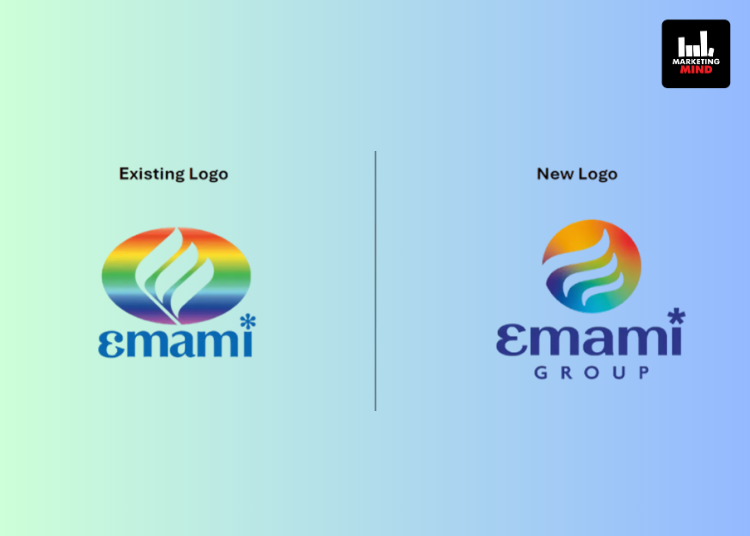
Emami has launched a new corporate brand identity to mark the completion of 50 years. The update reflects a shift in how the company wants to present itself while continuing to retain elements of its original design and values.
The previous ellipse has been replaced with a sphere, intended to signal Emami’s focus on global markets and adaptability. The stylised ‘e’ in the logo represents the company’s emphasis on reinvention and growth. The colour palette has been kept largely the same to maintain brand recognition.
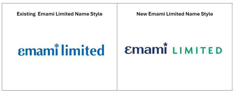
The wordmark has been updated with a new typeface aimed at improving clarity and reflecting a more modern visual style. Emami has also said that each of its businesses will now use individual colours and typefaces drawn from the central brand identity, creating separate visual identities under the same umbrella.
The company expects the rebranding to be rolled out across its businesses over the next few months.
“Our rebranding marks a pivotal step in Emami’s evolution,” said Mr Harsha Vardhan Agarwal, Vice Chairman & Managing Director, Emami Limited. “Our new core corporate identity reflects who we are today — an organization rooted in heritage but powered by innovation, diversification and a global outlook. It is a symbol of the journey we have made, and the exciting path ahead. We believe this refreshed corporate identity will strengthen our market position and foster deeper connections with our consumers and partners, as we continue to deliver high-quality, value-driven, and innovative offerings across our businesses.”


