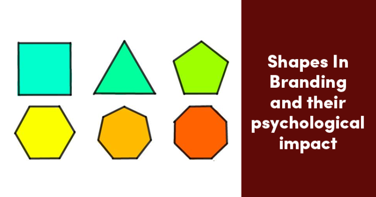
It takes a lot to design a proper logo for a brand. There are many factors that go into play to attracting prominent customers to do the needful. One wrong move can ruin your brand, hence the correct shape is very vital for the face of your brand.
In this guide, we’ll discuss the psychology of shapes and how they effect a brand’s identity,
Circles

Since a circle is inclusive, it has no end. For communities that represent harmony, friendship and matrimony, the circle will be great for strength, and consideration for one and all. Hence, if your brand logo has a circle, it will be a great idea to attract positivity for your brand.
The community ”Now I Begin’ targets mental health awareness. The circle removes the stigma associated with mental health, and ensures that the company carries out the correct message.
Rectangles

The square or rectangle is an elegant and professional shape. If your brand focuses on conservatism or address an important issue or niche, you should definitely incorporate this shape for your logo. It will also make your customers take you seriously. You can also add a burst of color to make it look appealing.
This logo was designed for a law firm, that incorporates a square rim, with cursive fonts that make it look elegant and feminine.
Triangles

Triangles represent masculinity, and they predict a steady flow of movement. Hence, the whole concept of generating ideas comes easily for brands with triangular logos, as is evident for ‘Data Square’. The interlocking triangles also combine a square pattern that denote the solidarity of a brand, combined with the ideology of the brand being more innovative than usual.
Which kind of a logo would you use for your brand?
Source: The Logo Company


