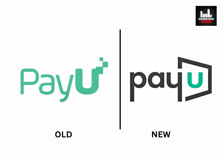
PayU, a digital payments service provider has unveiled a new brand identity to reflect the brand’s ambition of evolving beyond payments to deliver comprehensive financial solutions, positioning itself as a progressive brand in the digital financial ecosystem.
The rebrand exercise has been carried out by Havas Brand and Design Consultancy- Conran Design Group.
Aiming to become India’s largest and most valuable digital financial services company which is ‘Made in India, for the world’, PayU is now shifting gears to positioning itself as a progressive brand in the digital financial ecosystem.
As part of the rebranding exercise and transitioning from a payments-centric entity to a fully integrated platform that serves merchants, consumers, and financial institutions alike, the brand had revealed its new logo at the Global Fintech Fest 2024.
Designed by Conran Design Group, the new logo reflects a portal to ‘infinite possibilities’ and thereby a gateway for growth, transformation, and the future of finance. The design, on the other hand, features a dynamic ‘U’- emphasising the importance of all of PayU’s stakeholders including customers, employees, partners, and communities.
Additionally, the modern typography and fresh colour palette of the refreshed brand identity also complement PayU’s ‘innovative’ and ‘approachable’ character, with the colour green signifying growth and grey representing professional expertise.
As per the brand, its refreshed brand identity is anchored on three core pillars– Customer-Centricity, Trust, and Innovation and aims to create a unified, full-stack digital financial services platform that seamlessly integrates payments, credit (LazyPay and PaySense), and PayTech as a Service (PaaS) (Wibmo).
Following the logo unveiling, PayU has also rolled out two brand films highlighting its customer-centric approach and its promise of empowering users- be it merchants, consumers, or financial institutions in order to help them unlock their potential, and achieve their financial goals and dreams.
Link to the brand film:
Commenting on the development, Renu Sud Karnad, Chairperson, PayU Payments Board of Directors, said, “PayU’s refreshed brand identity represents a strategic move to align with its evolving business objectives of building a scalable and integrated digital finance platform, adapting to a dynamic market environment. Congratulations to the team on this significant development.”
To this, Anirban Mukherjee, CEO, PayU, added, “As we continue to redefine the digital financial services landscape, our new brand identity reflects our unwavering commitment to innovation, trust, and customer-centricity. By positioning ourselves as a ‘Resiliently Progressive’ company, we’re signalling our ability to navigate a rapidly changing market while staying true to our core values. Our goal is to not only become India’s largest and most valuable fintech platform but also to set the global standard for digital financial solutions.”


