As 2022 comes to an end, it’s time to look back at the year and mark the important occasions of the year. When we look at the business and marketing world, one of the important events of this year is the logo redesign of many established brands.
A few brands have redesigned their logos, and we absolutely love them.
Let us look at 10 Logo Redesigns of 2022
1. Instagram
First things first. Let us start with everyone’s favorite Instagram. Instagram has very smartly redesigned its logo where much has not been changed yet a fairly new design gives a refreshing feel. The color scheme is almost the same, but the lines appear to be thicker and the gradient looks more pleasing to the eye.
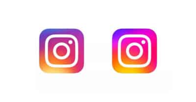
As per Instagram, the new logo gives the brand a new identity and is ‘designed to embrace continued evolution to help…create more immersive and inclusive experiences.’ Sounds really cool on the brand’s part right?
2. Sprite
Sprite is Coca-Cola Group’s second-largest beverage brand. The brand has recently updated its logo as a part of a global brand refresh.
![]()
Sprite’s new logo is quite similar to the old one with a very slight difference in the color and the old border removed. The new logo has a minimal approach and an interesting font.
3. Toblerone
This one comes all the way from Switzerland. We see your mouth watering already. Right? Yes, we all love Toblerone and we love its new logo too. The well-known chocolate brand has given its logo an impressive makeover. The color palette in the new logo looks more expressive and bold. The fresh branding focuses on the ‘Be more triangle’.
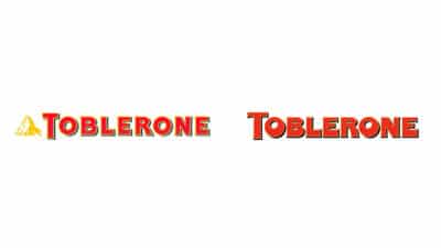
The new brand logo gets rid of the triangular peak and appears to be bold in terms of font and color.
According to Bulletproof, the agency that has designed Toblerone’s new logo, its new identity allows the company “to do things in a more progressive way, encouraging uniqueness and celebrating all things triangle”.
4. M&M
As we are talking about chocolates already, let’s make this article sweeter. M&M’s chocolate characters got a makeover and the logo has gotten tweaked.
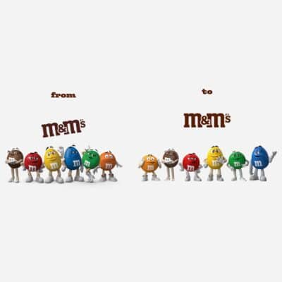
The M&M characters have got new shoes and the new logo looks more comforting to our eyes which has changed from an angled logo to a straight one.
5. Baskin Robbins
The color of a brand’s logo has a huge impact on its audience. Baskin Robbins makes an effort to revive the pink and brown used in Baskin Robbins’ original advertising campaign in 1953 and it looks like the brand is all set to go back to its roots.
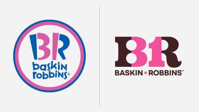
The new Baskin Robins logo has a retro look and the brand aims to attract new audience through its rebranding.
6. Minecraft
Minecraft is a sandbox game developed by Mojang Studios which is quite popular among its audience.

The brand has made subtle changes to its logo which gives it a refreshing look as well as keeps it comfortably similar to the older one.
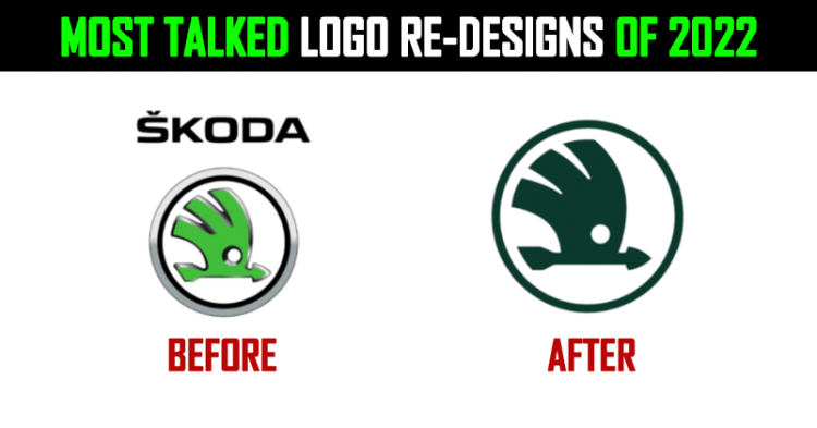
7. Skoda
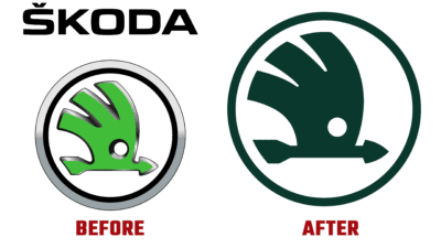
Skoda has changed its logo after many many years and we are a fan. The new design puts more emphasis on the name and has a gorgeous color palette.
Take a look.
8. Aston Martin
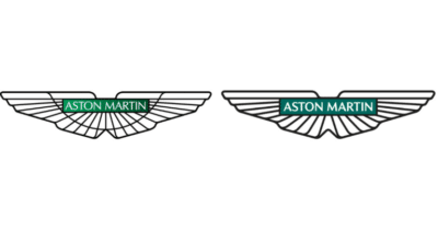
The iconic British sports car manufacturer is an internationally admired luxury brand. The brand has redesigned its logo after nearly 20 years. The updated logo has a different font and color giving it a more refined look.
9. BATMAN
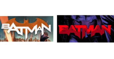
We know we know. All of you BATMAN fans are well aware of it and have discussed each and every angle of the new logo in detail. The new logo was released on July 5, 2022. The logo features the shadow of the bat symbol with interesting colors and a gothic feel.
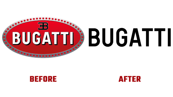
10. Bugatti
Bugatti has changed its logo for the first time since it was created at the beginning of the company’s existence. Bugatti’s new logo is a classic design that is completely revamped. The classic red medallion is completely removed from the composition and the new logo only has Bugatti written in bold black uppercase. The new design looks quite minimal yet very very classy.
