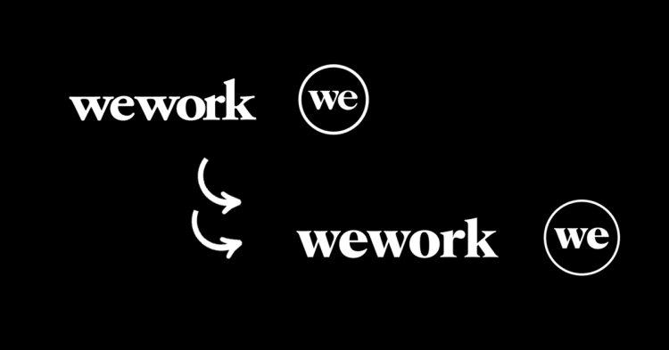
WeWork, the global provider of coworking spaces, has introduced a refreshed brand identity in an effort to modernize the company while preserving its essence as it enters a new phase.
WeWork collaborated with creative brand agency Franklyn to lead the rebranding process, which includes a redesigned logo, a new color palette, hand-drawn illustrations depicting individuals and spaces, and a custom typeface that will be used across all WeWork platforms.
According to Patrick Richardson, Co-Founder of Franklyn, said “As WeWork members, we have firsthand experience of the magic you feel working in a WeWork space.”
“WeWork blurs the line between art and science, emotion and intellect; and it was this duality that inspired the company’s new visual identity” he added.
How it will show up
The updated brand identity will be applied to WeWork’s digital, social, internal, and external channels, including member interactions and the app. The new logo and custom typeface will coexist with the existing brand during global asset updates.
Logo Rebranding
The updated logo design retains the original logo’s overall shape, subtle curves, and lowercase style while incorporating a modern, professional, and scalable design. It ensures that the old and new logo can coexist seamlessly.

‘WeWork Serif’, a custom typeface developed by A+ in collaboration with Franklyn, ensures brand consistency and confidence by establishing a visual connection between logo and copy. WeWork secondary typeface, Aperçu Pro, will be used for body copy.
A focus on products and prioritizing people

WeWork’s new illustrations depict the diverse ways their members work and engage with their spaces. With a hand-drawn style, these illustrations maintain a consistent human touch while showcasing the range of their evolving product offerings and amenities. This blend of humanity and flexibility empowers individuals, teams, and organizations to create their ideal workday.

Expanding on current photography style, WeWork will feature more detailed shots that capture the art and science of WeWork’s uniquely designed spaces. This includes showcasing the functional and thoughtful design elements as well as the human presence and how their members utilize the spaces.
WeWork is among the brands that have embraced modern and refreshed identities this year, joining the likes of Fanta, the soft drink brand that underwent a bolder and more vibrant rebranding.
So, how did you like the new rebranding of WeWork?
Also Read: Revamped And Remarkable: 12 Impressive Company Rebrands Of 2023


