Have you ever found yourself amazed by how subtle changes in brand’s logo, packaging and designing can make such a crucial impact on the mind of customers? Well, rebranding is a strategy which if used properly, can help any brand to connect better with its target audience. So, with this article, we are sharing some of the best rebranding announcements from popular brands in 2023. Have a look:
1. Pepsi
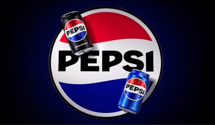
Pepsi has changed its logo for the first time in 14 years. According to Mauro Porcini, chief design officer of PepsiCo, the redesign’s objective is to develop a visual identity that connects with current consumers while paying homage to the brand’s history. The audience online has been praising the fresh appearance since it has been launched.
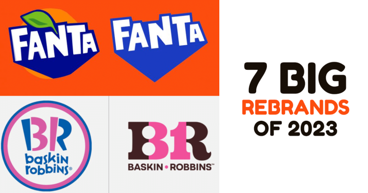
Fanta
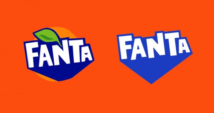
Another beverage brand that created a buzz worldwide with its rebranding. Fanta, which is known for its unique advertising approach is now impressing people with this new look.
Baskin Robins (BR)
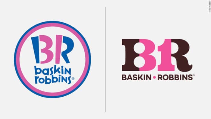
The iconic ice cream brand, Baskin Robbins, has introduced a new corporate identity. The new logo reflects the brand’s distinctive humor, assurance of excellent taste, and high caliber. With this new look, Baskin Robbins aims to win over a younger generation of customers.
The goal of the logo is to give consumers an engaging and thrilling experience. Every component, from the fresh, vibrant colors to cutting-edge designs, has been carefully planned to emphasize the whimsical essence of the brand and to create a welcoming environment. The brand’s promise of 31 flavors — one flavor for each day of the month — remains intact.
LG
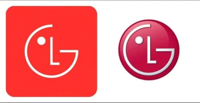
LG unveiled a new visual identity with a flatter digital logo and LG Active Red, a lighter shade of red. The iconic Life’s Good brand tagline, which uses a new typeface, will be utilized more frequently in advertising and product packaging. To reimagine its brand identity, LG is trying for a more “dynamic and youthful” appearance.
LG also intends to bring more personality to its iconic logo on the web by employing expressive actions such as winking, smiling, and nodding.
7UP
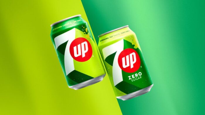
After seven years, Pepsico has decided to reinvent 7UP with a new visual identity. The new design expands on the flat design path and gives the ‘7’ a thick extrusion that nicely links in with the brand name and positioning. It will be utilized for both 7UP and 7UP Zero Sugar.
‘New Get Up, Same 7UP’ is the slogan that has been used in the new look.
Nokia

Nokia has launched a refreshing logo after a long period of time and it seems like the brand has given a new look according to the digital transformation that the world has seen in the past few years.
The goal of Nokia’s rebranding is to better reflect the company’s creative and modern business practices. Align the brand with current fashion trends at the same time.
Castrol
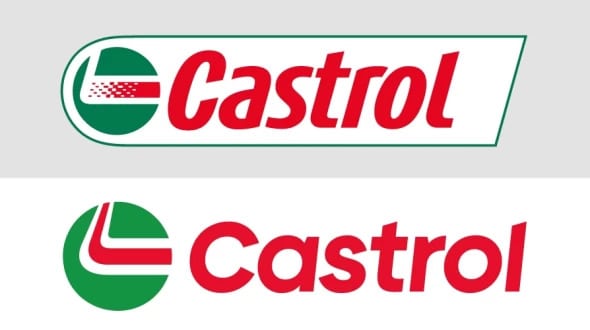
Castrol introduced a new logo design with a modernized style and feel. This update aims to more accurately reflect the company’s distinct market positioning and the potential it sees in adapting to clients’ shifting requirements.
The redesigned logo has a more modern, dynamic, and vivid style, with an emphasis on our key strengths and differentiators as Castrol seeks to widen its appeal with a more diversified client base in lubricants, services, and solutions. The classic red, green, and white hues of Castrol are still present.
Also Read: 5 Most Successful Rebranding Ad Campaigns Of Popular Brands
Which among these did you like the most ?
Let us know in the comments section.


