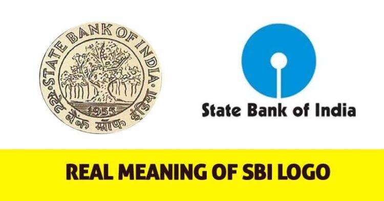
A logo is very important for forming the type of image that a company, brand or financial institute wants to build in the minds of people. State Bank of India has a blue-coloured logo with a small cut at the bottom. Blue has always been seen as a trustworthy, loyal and dependable colour. It is one of the most used colours in marketing these days because of its secure feeling, blue has always been a favourite colour of the financial sector.

The current logo of SBI was designed by Shekhar Kamat, who is the creative head at National Institute of Design, Ahmedabad. The first time this logo was officially seen was on October 1, 1971, which was the inauguration day of the SBI Central Office building at Backbay Reclamation, Bombay. There are many stories about this logo and many believe that it is inspired by the Kankaria lake in Ahmedabad.
This iconic logo is circular in shape and the maker has done this to express unity and completeness that SBI wants to see in the country by providing best banking services to the people of the country. Also, the small circle in the centre shows that the big portion of people that use banks for small transactions are the ones who hold the bank together.

This is not the first logo of SBI, in 1955 it had a logo of a banyan tree as it has strong roots and branches which have the capability of growing in all directions. But this logo was removed as it received criticism with the fact that Banyan tree other plants to grow within its space.
Bruna Piovesan Takes Over As Global Head Of Marketing At Uber Advertising
Uber Advertising has announced the appointment of Bruna Piovesan as its new Global Head of Marketing. In her new role,...


