When you talk about the strategic management of a company, there always lies an important question, will any change bring about benefits for the company? If yes, then what?
In a similar manner, what was surprising yet mischievous was the development of a new idea of change initiated by companies in the past few years. It was the increased efforts in branding and alteration in the logo, in order to develop customer interest or work on cultural aspects.
However, all such moves don’t always work. Many brands actually suffered a setback when they changed their logos, due to controversies and rebranding discrepancies.
1) Zara went too close

Zara launched a new logo, still in black but had its alphabets arranged closely together. The brand shared the reason as an initiative to pay to the predecessor it has in 2011 and become a logo that portrays a more fashionable, luxurious look. However, it received negative feedback about being a clustered and claustrophobic design which seemed to have been made by robots.
2) Pepsi didn’t work out well
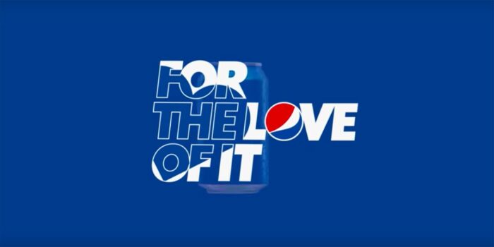
Well, Pepsi didn’t exactly rebrand its majestic logo but changed what comes next, the tagline. The new Pepsi cans that came out recently in 2019 had the tagline ‘For the Love of it’ hinting at the use of the aerated drink during parties, outings, and events, highlighting the special bond that we have developed for ‘cold drinks’ over the years. However, Pepsi has claimed a copycat as it was believed the tagline was stolen from McDonald’s ‘I’m Lovin’ it’ brand tagline.
3) Sears went for the tears
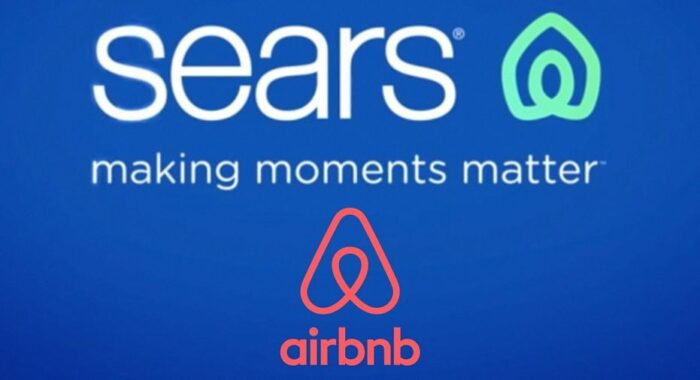
Sears went for a revamp in 2019 after struggling a lot in the past couple of years. It came at the verge of shutting down due to negative returns and executive messiness. Then came the final straw, the logo change. Its new logo was extremely similar to AinBnB’s logo where even the new Sears tagline ‘making moments matters’ was compared to the business model of AirBnB.
4) Slack was lacking the right vibe
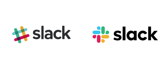
Slack also recently decided to go for a revamp in March 2019, where it launched a new colourful logo in four colours. However, it immediately backfired hurting religious sentiments by being called similar to the Nazi Swastika. Moreover, it was also called similar to the colour-filled logo of Google Photos.
5) Volkswagen goes sleek
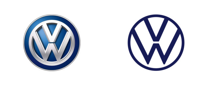
Volkswagen decided to level up by enlisting a logo that signifies the brand and its principles. The newest logo is quite similar to the previous one but called a sleeker, modern and clean version. However, many designers reviewed and commented about the lack of definition, angles and designing basics in the logo and unapologetic ignorance of all designing rules.
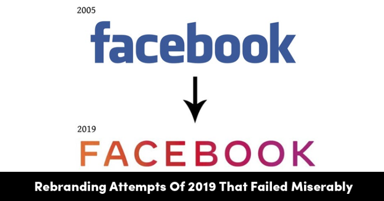
6) Facebook opts to bring a change
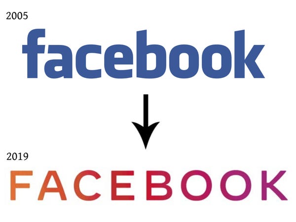
Facebook rebranded its logo to make a more minimalistic yet impactful design recently. The latest is the brand name in plain, simple, block letters with equal spaces in between. The catch is that not only does it replace the ‘white letter f’ which defined Facebook once upon a time, but the letters also alternate between colours. While Facebook’s goal was to portray the resonance amongst its other babies (Whatsapp and Instagram) that added to Mark Zuckerberg’s portfolio over the last decade, critics called it a safe and unnecessary move.
These rebranding scandals show that not every decision can lead to great benefits and might backfire. But then again, what’s the fun without risks?


