Apple is arguably the most iconic brand in history and their logo is universally recognizable. It’s simplicity and straightforward aesthetic makes this a timeless symbol to represent the most valuable company in the world.
But the Apple logo hasn’t always looked this way. In fact, you may not recognize their logo from 1976. To be honest, it looked more like an illustration.

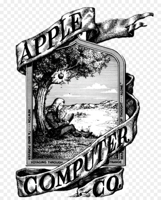
This logo was created by Ron Wayne, Apple’s third co-founder. It featured Isaac Newton sitting under an apple tree reading a book. A fabric banner surrounded the image that said “Apple Computer Co.” but there was more text featured on the pictures frame. This logo clearly had some artistic value, clearly, Steve Jobs wasn’t a fan. He argued that apple should have a more stylish logo and thought this logo could be part of the reasons for Apple 1’s low sales. Illustrated logo was too intellectual for a technology company and it was simply too complicated to reproduce it on computers in small sizes.

Rob Janoff, the art director of Regis McKenna Advertising helped Steve Jobs in creating the new logo. Jobs knew the Apple 2 was going to be launched on April 17th, 1977 and he wanted Apple to have a fresh, modern look. Rob started with a silhouette of a black apple on the white background but felt that something was missing. A play on words that Apple had previously used in Advertising for the Apple 1 “BYTE INTO AN APPLE…..$666.66*” may have helped Janoff get the idea that a bite should be taken out of the apple. Janoff said he included byte “for scale, so people understood that it was an apple and not a cherry.
However, Bill Kelly, who also worked for the same advertising company had a different story to tell. He said that the bite was symbolic of acquiring knowledge, a biblical reference to eve eating from the tree of knowledge


