I sometimes get surprised that what can be the idea behind the brand logos. I am sure those of you reading this must have felt the same ways. So does it actually mean something or is it just an artistic representation?
There’s nothing beyond logic in this world! It is that such beautiful logos and each curve is sculpted for representing something. They have a hidden motive and message behind them.
Here we list for you few of such famous logos and the hidden meanings behind them. Get ready!
1. Pepsi
Pepsi has been changing its logo since a long time. It has spent almost millions of dollars to create the new logo which represents the globe and has a color of red, blue and white. It is seen as one of the toughest logos of times as it brings into account topics like Earth’s magnetic field, Feng shui, Pythagoras, geodynamics, the theory of relativity, and the golden ratio. The designer has mentioned that the design has similar traits like the famous paintings of Mona Lisa, the Parthenon, and even René Descartes. The colors though represent the American Flag.

2. Coca-Cola
The logo if observed closely one can observe that between the letters ‘O’ and ‘L’ of cola, the Danish Flag can be seen. This can be a mere coincidence as this was never used as a marketing strategy by the company in the Scandinavian country.

3. LG
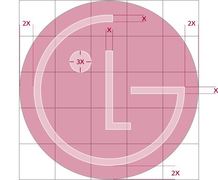
Their logo is pretty simple. So you must be thinking that then what can be the hidden message behind? But if you look close it’s actually an artistic representation of a person’s face. It has been made so that the customers can relate well to the brand and as their taglines say ‘Life’s Good’.

4. BMW
You are well aware of the BMW Logo. Though many believe that as BMW first started its venture as an aviation company so the logo with white and blue color represents the early history of aviation technology, but it is in fact simply a part of the Bavarian flag – a part of Germany where the company originated from.

5. Beats
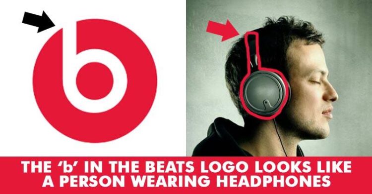
It is a producer of audio equipment in the USA. The logo represents a man wearing a microphone if observed closely.

6. Pinterest
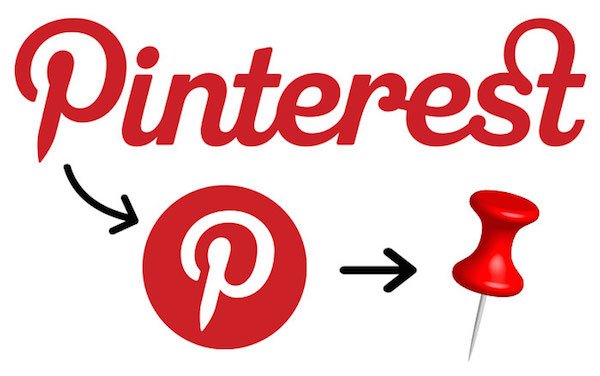
This is another popular social media site where people collect images they like and pin into their notice board. Keeping in mind the concept the ‘P’ in the logo also has a hidden pin there.

7. Formula 1
It’s an iconic logo with ‘F’ written in black and the red strips follow. If you look carefully at the white space between the letter ’F’ and the red stripes in the Formula 1 logo, you can see the number 1. The red lines represent also the speed of racing.

8. Toyota
People have come up with different representations associated with it. First, they explained that this can be a cowboy in the logo. But actually, it represents an eye of a needle and a thread passing through it. This is so because earlier the company was associated with weaving machine production. At the same time, the individual parts of the logo also spell out the letters of the company’s name.

9. Amazon
At first look, it appears pretty simple with just the name and a yellow swoosh at below. But it also has a hidden meaning attached to it according to the company’s motives. The arrow represents a smile that depicts customer satisfaction. Also, the arrow from a to z depicts that the online retail company sells every possible object on this earth.

10. Apple
Who is not familiar with this half ate apple logo? Rob Yanov, the designer who created the world-famous Apple logo, explained how he came up with the idea: “I bought a whole bag of apples, placed them in a bowl, and spent time drawing them for a week, trying to break the image down into something simple. Taking a bite out of an apple was part of the experiment, and completely by coincidence I realized that ’bite’ sounded exactly the same as the computer term ’byte’.”

Any other hidden meaning of brand logos you are aware of? Let us know!


