Mastercard is looking to make some changes in its designing and branding. The company which is worldwide known for its credit cards has removed its name from its intersecting circles logo for the first time since its 1968 creation.
So, next time you see its branding, don’t get confused as from now, the red and yellow Mastercard symbol will stand alone without the wordmark across all digital and physical communications, including sponsorship properties and retail locations.
Also Read: 5 Most Successful Rebranding Ad Campaigns Of Popular Brands
Meaning of Mastercard’s logo

The move has been decided to allow the company to mark better across digital media. According to the latest research from Mastercard, more than 80% of people recognize the symbol without the brand name. The red and yellow interlocking circles have been the hallmark of the Mastercard brand for more than 50 years, symbolizing its promise to connect people for infinite possibilities. The circles are a powerful symbol that brings people closer to their passions to give them confidence and trust so that they can have a secure financial life.
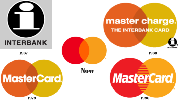
Logo evolution of Mastercard
Mastercard hasn’t been much experimental with its branding as the last logo remained with the brand for a very long time. Below is the evolution of Mastercard’s logo since its inception.

Nike, Apple and Lacoste are some other brands that have logos without wordmarks. Formula 1, has also changed its logo last year to give a minimal look according to the digital age.


