


Everyone who makes it big has always made a few mistakes along the way. Infact, more often than not, these mistakes are the turning point in their lives that ultimately lead them to success.
Big brands that we all adore and remember, we remember them by their Logos. Yet, guess what? All of them had something different as their Logos first, like a big-big mistake and once the logo changed, so did the Brand’s success graph, all for the better.
1) Google
![]()
Google used an exclamation mark in its logo and made it look quite similar to its competitor Yahoo. Infact, this was done when Google and Yahoo were fighting a pretty tough battle to gain market share. However, then in 1999, the logo was changed again to reach its current glory.
2) Gap

GAP suddenly changed its logo, making it super simple and difficult to memorize. Then, when it realized the change wasn’t making the necessary impact, it spent a whopping 100 million dollars to bring the old logo back, impactful and bold.
3) Marriott Hotels
![]()
The old Marriott logo was repetitive and took space than what was necessary. It has a similar design repeated as a long and then as an initial. Luckily, Marriott realized it’s mistake early in the span and changed it back, keeping normal letters in a decent size and pushing the smart logo in front.
4) NASA
![]()
NASA has a standard record of having amazing logos which are appreciated. Yet, there was a time when all its basic red lettered logo was called boring and unrelated to science, the term that defines NASA. Hence, it finally got back its infamous meatball logo.
5) Starbucks
![]()
The earlier logo released in 2008 got complaints from many religious bodies due to the fact that the famous Siren in the logo was kept completely visible yet naked. And well, Starbucks is a favourite spot for teens and kids. Hence, in 2011, the famous green textless, half-siren logo was released which shines till date.
6) Pepsi
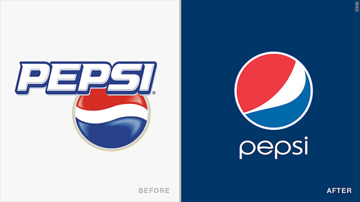
Pepsi changed their Logos to a ball in three colours, creatively added to look aesthetic. Yet, it was criticised by various artists as a logo that taunts the fat people or actually signifies the calories Pepsi brings with itself. However, Pepsi has kept it’s USP, still the same.
7) Reebok
![]()
With Reebok’s old logo being a fan favourite and competing with the likes of Nike and Adidas, things changed around when Adidas purchased Reebok. The logo has now become a delta sign, which doesn’t look anyway related to sports professionals and is highly criticised.
8) Oxford dictionary
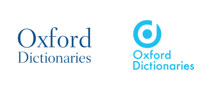
Even when Oxford changed it Logo to something which resembles the Beats by Dre logo, it invited more criticism than praise. After being a leader in the education industry, making such mistakes wasn’t appreciated.
9) Instagram
![]()
When Facebook purchased Instagram, the logo was suddenly changed. Instagram’s old logo with a cool vintage camera was changed to a brightly shaded and coloured square which hinted at a camera. Everyone was disappointed but then again, it has remained the same and honestly, people got used to it.
10) Animal planet
![]()
Like the name suggests, the channel earlier had a logo with a globe and an elephant as its logo. Pretty perfect actually. However, a few years back, they decided to remove that logo and come up with a back printed alphabets logo, just in a different font. Sadly, it has remained the same.


